✍️ Intro:
Scroll back a year, and you’d see a folder stuffed with 78 logo drafts—each one different, each one wrong. Some looked gritty, others polished. Some focused on nature, others on machinery. But none of them said what I needed them to say. None of them worked across all the tools and systems I use—3D printing, laser engraving, CNC, and consulting.
At first, I was chasing aesthetics. What I learned is that branding—like entrepreneurship—isn’t about what looks good. It’s about what aligns.
This post breaks down how I built a logo that reflects who I am, what I do, and why I show up every day with purpose. Not just resilience—but resilience, repurposed.
Behind the Logo: The Process That Built a Brand That Works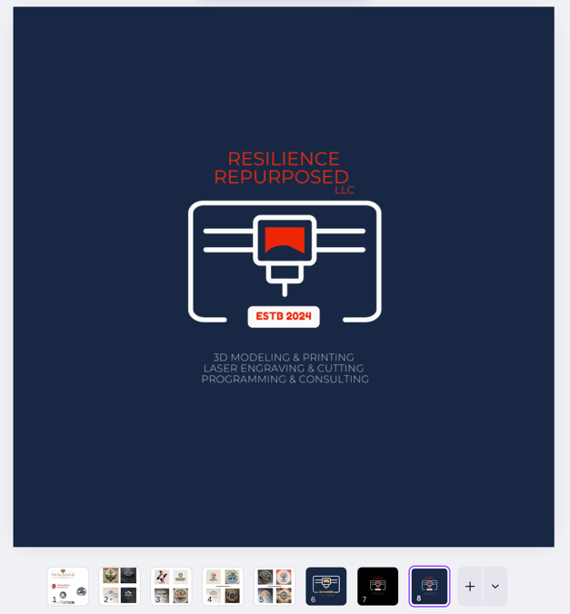
Before you ever build a brand that grows, you have to build one that fits. Not just visually—but strategically, functionally, and personally. This is the story behind the logo I chose for Resilience Repurposed LLC, and what it taught me about alignment, systems, and sustainable identity.
🎯 From Too Many Ideas to One Aligned Identity
When I started Resilience Repurposed LLC, I didn’t expect the hardest design choice to be my logo. Over the span of a year, I created over 78 drafts—some clean, some raw, and most of them wrong.
At first, I tried fun symbols, abstract icons, and edgy graphics. They looked cool—but when I mocked them up on product packaging or laser engravings, something felt off. They didn’t say “this is a business that uses engineering, design, and advanced manufacturing to solve real-world problems.” They said, “this might look good on a sticker.” And I needed more than that.
So I went through every version—erased parts, repurposed lines, simplified shapes. I took notes. I tested how they looked on screens, in vector files, and on real-world items like business cards and workshop signage. One by one, I ruled out every option that didn’t reflect what I actually do.
Eventually, I landed on a design that looked like a 3D printer head—but also resembled a CNC router and laser engraving tool. It worked across every service I offer. And it was simple, strong, and scalable.
I chose red, white, and blue not just for contrast, but because of what they stand for. As a U.S. Army veteran, that color palette connects to my roots. The text below the symbol lays it out clearly: 3D modeling & printing, laser engraving & cutting, programming & consulting.
This logo now lives on my products, proposals, and professional identity. And it’s working—because it does what every good system does: it communicates clearly, performs consistently, and grows with purpose.
💡 Final Takeaway
A logo isn’t just a design. It’s a decision. If your branding doesn’t communicate who you are and what you deliver, it’s just decoration. Form follows function—even in business identity.
🔁 Coming Next
I’ll be sharing the principles behind how I systemize my work—from custom fabrication to client onboarding—and how these systems support my mission to serve veteran entrepreneurs and small businesses alike.
💬 Share This With a Future Founder
Know someone struggling with branding? Send this their way. Especially if they’re caught up in “cool-looking” instead of “clear-working.”
📬 Subscribe to Resilience Repurposed
Want insights on sustainable manufacturing, veteran entrepreneurship, and building systems that scale?
👉 Or follow us on Instagram